These 25+ free button UI templates range from reusable Figma components to editable PSD button packs for websites, apps, dashboards, landing pages, and sign-in screens.
The Figma kits use Auto Layout, variants, interaction states, CTA styles, social sign-in patterns, and iOS-inspired components. A PSD section contains editable Photoshop button packs for older mockup workflows.
Note that Licenses differ by creator and platform. Check the original resource page before using a file in client or commercial work.
Last Updated: September 7, 2026
Free Figma Button UI Templates
Mobile Button UI Kit for Figma
Primary, secondary, tertiary, ghost, social, quick-action, compact, and floating action buttons with default, hover, pressed, and disabled states.
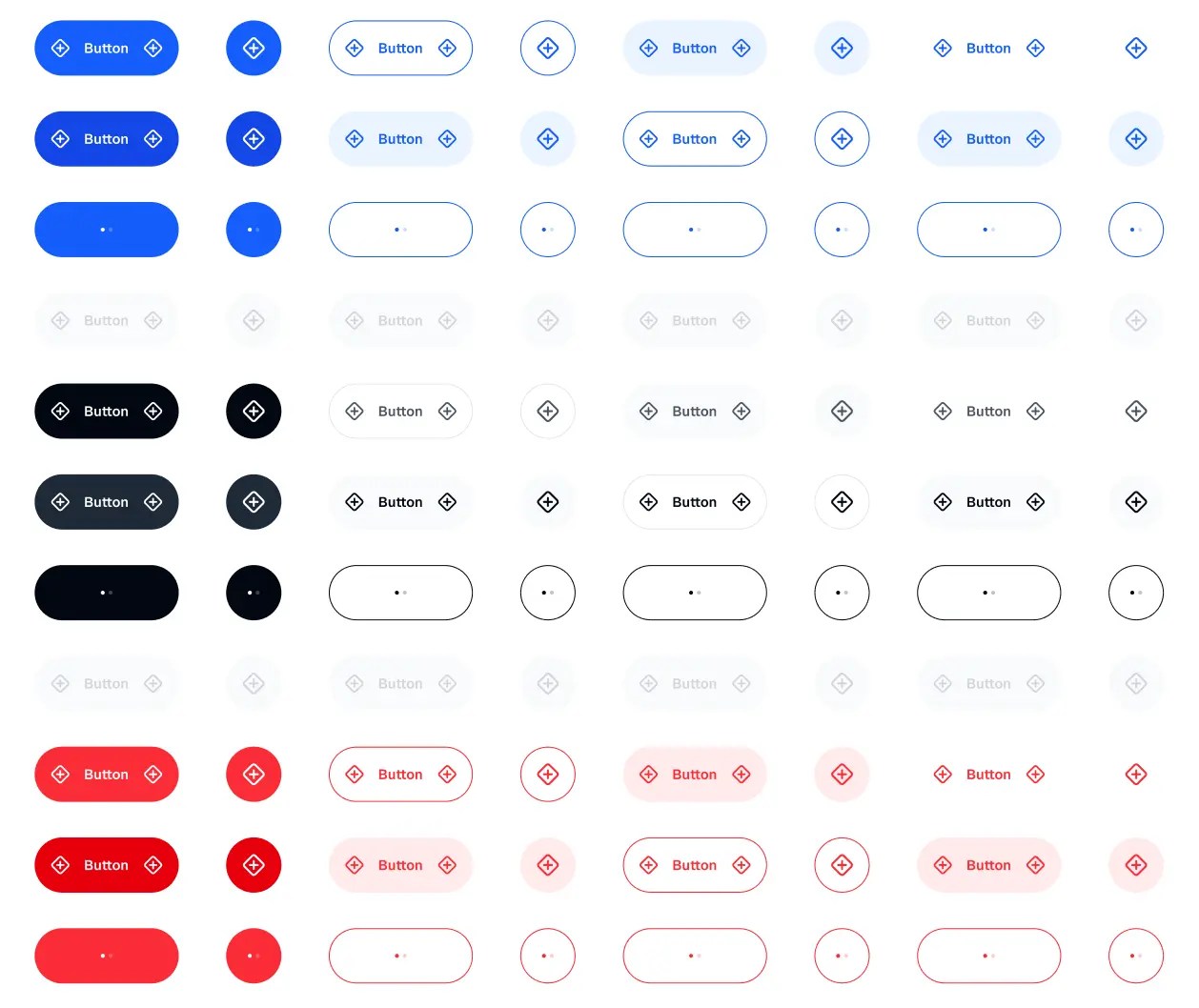
Figma Button UI Kit with 120 Variants
120 variants across primary, secondary, and outline styles, two sizes, and five interaction states.

Buttons UI Component
Reusable button components for general web and app UI work.

Modern Buttons UI Kit (3 Styles)
Rounded and pill-shaped styles in multiple sizes, with variables plus hover, pressed, and disabled states.
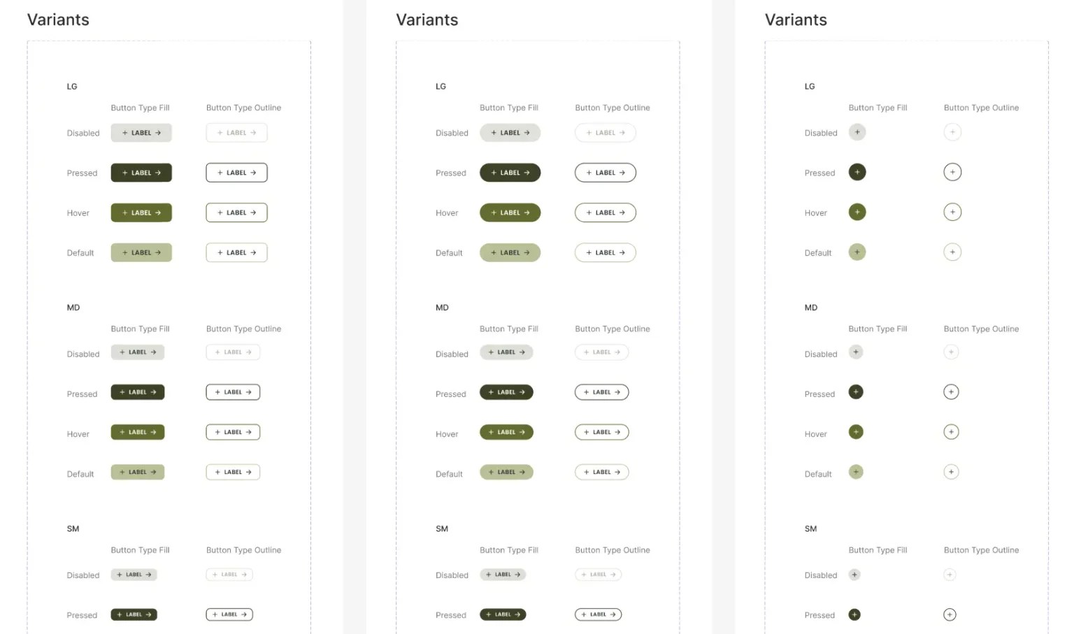
The Perfect Button Kit
Reusable button components built with Auto Layout and variants.
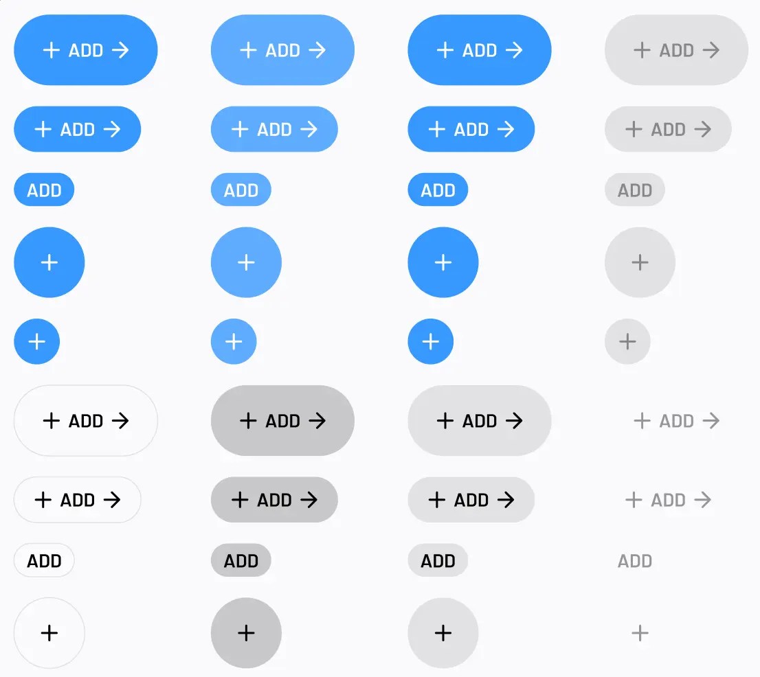
Free Web Button Kits (450+ Styles)
450+ button variants built with Auto Layout, master components, variables, light and dark modes, icon-only options, and common interaction states.
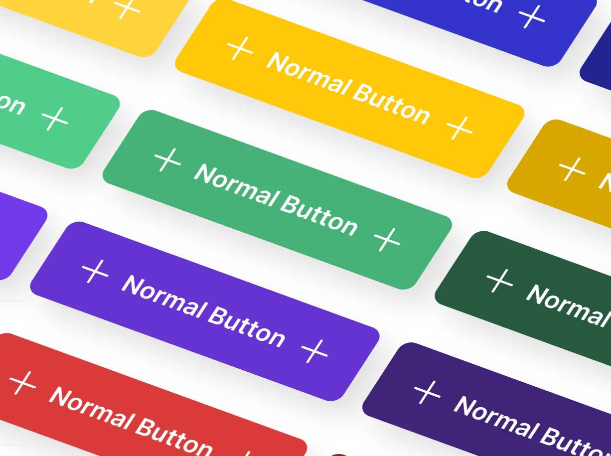
CTA Buttons
CTA button variants with boolean, instance-swap, and text component properties.

170+ Perfect Buttons Free UI Kit
More than 170 button variants for web and app UI work.

Linear Buttons
72 dark button styles inspired by Linear’s interface.

Button Component Foundation
Minimal flat button components in several styles.

Free Minimalistic Buttons
Clean button styles for simple web and app mockups.

Button UI Kit
40+ button styles and 350 variants for social sign-ins, app download buttons, and payment actions, with Auto Layout and multiple sizes.

Buttons for iOS
iOS-inspired flat buttons in multiple sizes.

iOS 26 Liquid Glass Buttons
Liquid Glass-style button components with editable states, multiple sizes, variants, Auto Layout, and color theming.

Call To Action Buttons Pack (12 Styles)
12 CTA button styles, including classic, rounded, sharp, glowing, cut-corner, and compact options.

Fram Design System Buttons Pack
Minimal CTA buttons with Auto Layout and variants.

Flat Buttons Figma
Common flat button styles, including options suited to iOS interface mockups.

Icon Style Web Button Template
Icon-and-label web buttons for Figma.

Facebook, Twitter & Google Login Buttons for Figma
Branded social sign-in buttons for Facebook, Twitter, and Google.

Free PSD Button Templates
These older PSD files are useful for Photoshop mockups, legacy interface work, and editable button graphics.
Colorful Buttons UI Kit
Colorful web buttons packaged as an editable PSD ZIP.

3 Flat Buttons
Three flat web buttons in an editable PSD file.

UI Flat Btns
Flat UI buttons in several colors, packaged as an editable PSD.

FREE Social Media Buttons
Layered social media buttons built from editable vector shapes. Download requires a DeviantArt account.

Buttons [FREEBIE]
Several web button color styles in an editable PSD file.

Social Sign In Buttons
Layered social sign-in buttons with brand HEX values.

How to Choose a Button UI Template
Choose Figma when you need reusable components, Auto Layout, variants, or prototype states across a website or app. Choose PSD when you need editable button artwork for Photoshop-based mockups, graphics, or legacy design files.
For product interfaces, prioritize clear primary, secondary, and tertiary actions plus hover, pressed, focus, and disabled states. Design-system work benefits from component variants, scalable sizes, and reusable states.
For full component sets, see our free web UI kits and free mobile app UI kits.
Related Resources
- 15+ Mobile App Download (App Store, Google Play) Button Templates For Free Download
- 10+ Best Download Button (Icon) Sets For App & Software Landing Pages
- 50+ Most Popular Web UI Kits For Free Download
- 100+ Best Free Mobile App UI Kits for Prototyping
- 80+ Best Free Dashboard/Admin Panel UI Kits & Templates
- 30+ Best Free Pricing Table Templates


