Empty state illustrations give blank screens a clear purpose. Use them when a search returns no results, an inbox has no messages, a cart is empty, a file upload fails, or an app cannot load data yet.

This collection gathers free empty state illustration packs for UI and UX projects, with a strong focus on Figma resources. You will find icons, cards, error screens, 404 pages, empty carts, empty inboxes, no-result screens, offline states, and onboarding-style visuals for web and mobile interfaces.
Last updated: July 02, 2026
9 Free Empty State & 404 Error Illustrations for Figma
Free Figma empty state illustrations with calm line figures, coral accents, and editable vector artwork for app and web UI states.

Empty States Illustrations Kit
A set of 20+ high-quality and fully editable illustrations for Empty States on your app.

120 Free Empty State Icons (Solid + Outlined)
This is a collection with 120+ minimal, clean empty state icons designed in Figma app.
It gives you ready-made visuals for screens with no content. You can add these when users see blank pages—like after a search with no results.
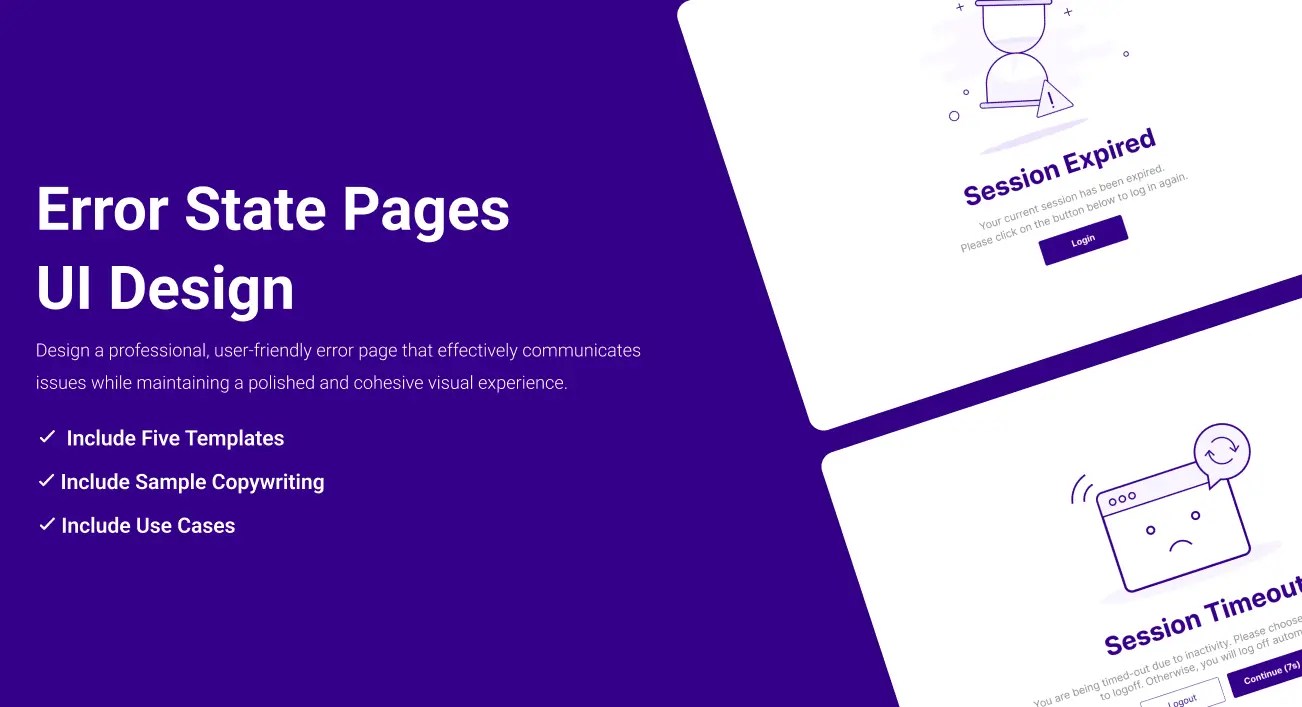
Error Pages Illustration
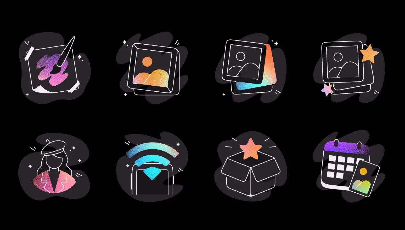
8 Empty State Illustrations
A collection of empty state illustration designs for a drawing product series, featuring a design style that merges lines with shapes and incorporates subtle textural effects.
24 Empty State Illustrations
Empty state illustrations are visual cues in user interfaces indicating the absence of content or data.
Empty States Illustrations
20+ open-source, fully editable empty states illustrations in Figma.

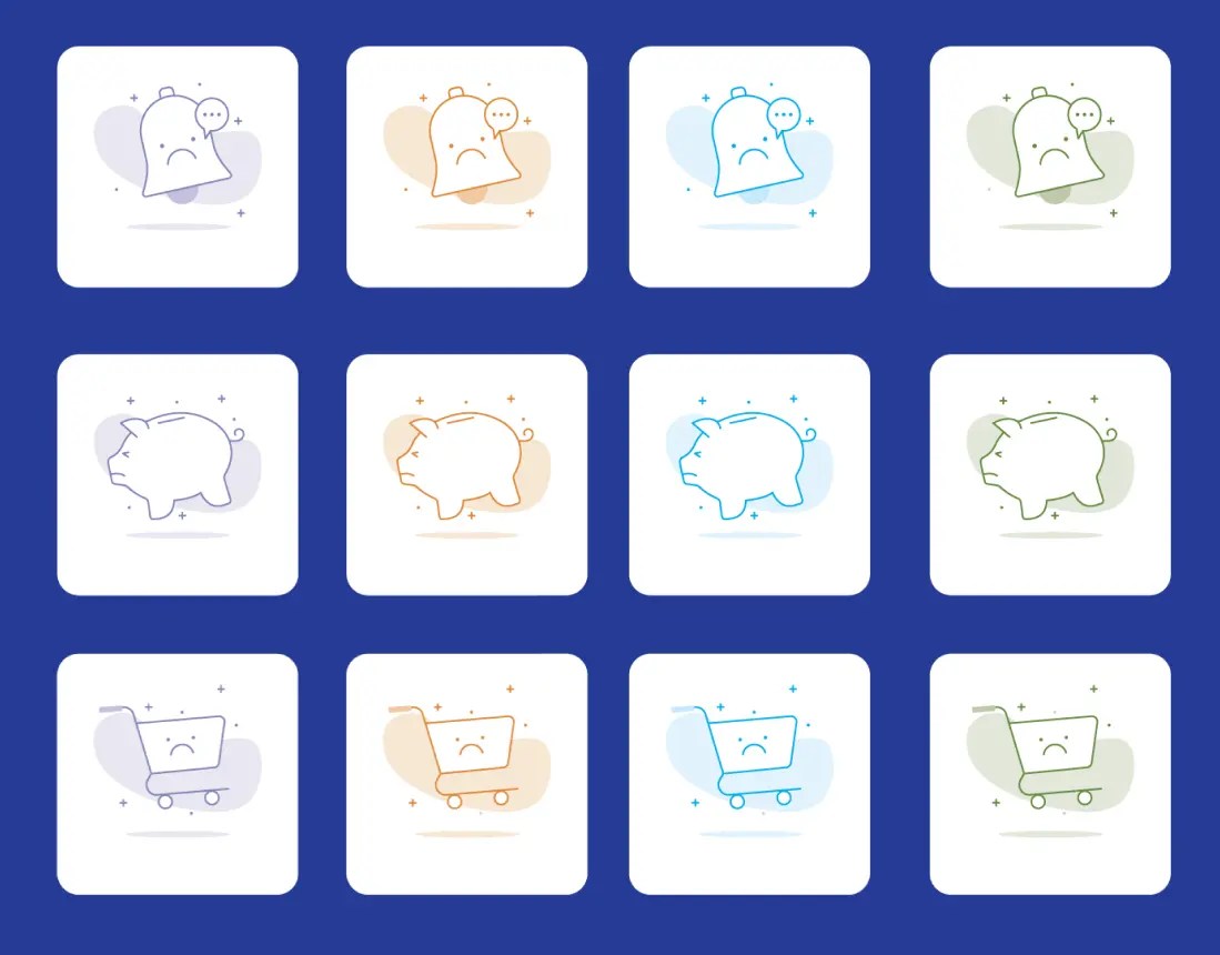
12 Empty States Icons
A set of 12 empty states illustrations: no images, no documents, no GPS connection, setup completed, Oops, no internet connections, inbox is empty, no results found, no messages, no credit cards, your cart is empty, and you’re all caught up.
Empty State Illustration Kit Figma
A set of 200+ illustrations for empty state design.

Error State Illustrations
A set of 30 cute and naughty illustrations for your next 404 page and error state design.

25 Empty State Illustrations
A set of pretty clean empty states illustrations in 5 categories: connectivity, e-commerce, message, social, and wallet.

8 Empty States Illustrations
A set of 8 carefully created and fully editable empty state illustrations: no message, no favorites, lost connection, result not found, no address yet, page not found, cart is empty, and no notification yet.

30 Colorful Empty State Illustrations
A set of 30 highly customizable empty state illustrations plus 7 beautiful templates for your next design.

9 Empty State Illustrations Sketch
A set of 9 minimal empty state illustrations for Adobe Sketch.

Empty State Illustration Kit
A collection of 25 empty state illustrations for your next web & mobile design. Includes lost connection, no notification, under maintenance, 404 not found, empty email box, welcome, file upload, file not found, no product, empty card, card rejected, no credits, card expired, and more.

Empty State Illustrations & Cards
A set of empty state illustrations, buttons, and cards in Figma format.

See Also:
- 10+ Creative Free 404 Not Found Page Templates For Inspiration
- 30+ Best Avatar Icons Packs For Free Download
- 60+ Best Social Media Icon Sets For Free Download
- 30 Best Emoji Icon Sets for Free Download
- 120+ Best Free Line (Stroke) Icon Packs For UI/UX Design
- 80+ Best Free Dashboard/Admin Panel UI Kits & Templates
How to choose an empty state illustration pack
Start with the screen you need to design. Empty search results, empty carts, no messages, failed uploads, offline states, and 404 pages all need different visual cues. A generic illustration can fill space, but a matching empty state helps users understand what happened and what to do next.
For product UI work, editable Figma resources are usually the easiest option because you can adjust colors, labels, layout, and component sizing inside the same design file. For quick concepts or older projects, icon packs, Sketch resources, and static illustrations can still work well.
Keep the message short. The illustration should support the empty state copy, not replace it. Pair the visual with one clear line that explains the state and, when useful, a direct action such as changing filters, uploading a file, adding an item, or checking the connection.


